
Design For Good Project:
CleanConscious
Summary
I had the opportunity to work with a team in developing a native iOS application called CleanConscious. CleanConscious connects both restaurant owners and customers who share the same views on sustainable and good-quality seafood. As a customer, they will be able to see restaurants that are focused on sustainable seafood, with mostly wild-caught options. A restaurant owner will be able to find the source of the seafood (local fish markets, restaurant depots) where they can purchase their seafood from. It will also provide both groups with a way they can participate in positive water pollution community initiatives, and donate to the cause. Because of the project timeframe, we will be focusing on the customer part of the journey.
Challenge
Now more than ever, ethical businesses need to transparently show conscientious consumers what kind of effect their product or service has on the environment. How might we help ethical businesses display their restaurants and stand out from other places that are not environmentally aware?
Clean Conscious wants to connect both restaurant owners and customers who share like-minded views on sustainable and quality seafood.

Key Drivers
In order to accomplish our objectives and tackle this challenge, we need our users to be able to:


Design Process
User Interviews
To gain a general understanding of where our target audience stands in terms of viewpoints and what they know about sustainable seafood restaurants and marine conservation, we conducted one-on-one moderated interviews. We wanted to find out:
What do restaurant customers do to search for a place to eat?
How do they feel about the quality of the seafood they are getting?
Are they interested in the events that help to clean shorelines?
Are they interested in donating to the cause?
Based on our responses, we created an affinity map.


Voice and Tone
Before we doing any design work, we wanted to figure out our voice and tone—who we are and aren’t. Setting our voice and tone is crucial in shaping the brand identity and relevant content for our target audience.


We aren’t:
We are:
Color Palette
CleanConscious is an application that inspires our community to live healthier and take action to help keep their local waterways clean. It is important that our brand colors are refreshing and friendly while also representing health, hope, and reliability.
Primary Colors
Secondary Colors
Accent 1 Colors
Accent 2 Colors
Layout/Text Colors
Font Usage
We decided that Open sans is the best font to be used throughout the iOS app. This font pack is widely accessible, easy to read, and is considered a humanist typeface, which aligns with our brand identity.


UI Components
These are components I designed for the iOS app.

Cards

Menu Bar

Search Bar

Buttons
Mid-Fidelity Wireframes
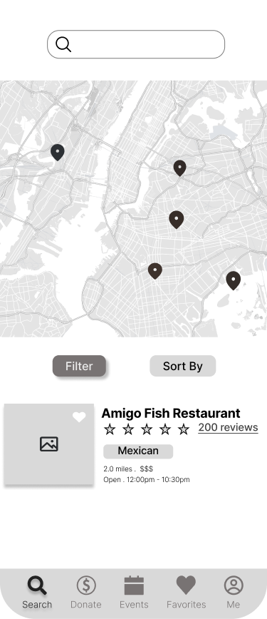
CleanConscious iOS App Search page


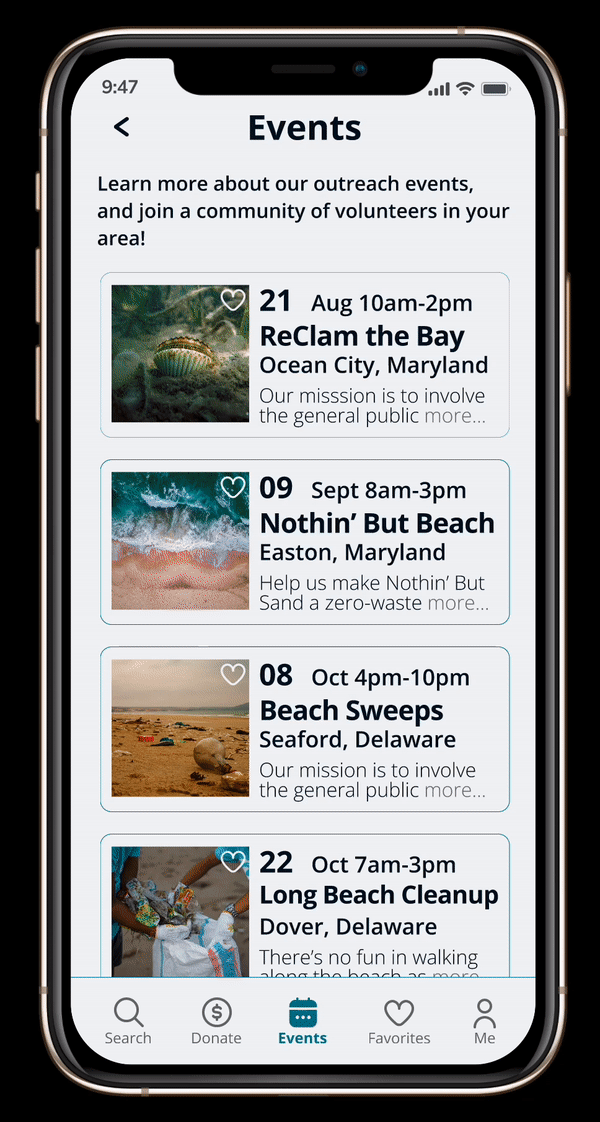
CleanConscious iOS App Event Info page
Hi-Fidelity Prototypes

Demo of CleanConscious iOS App’s Search page

Demo of CleanConscious iOS App’s Events page and Event Info page
Conducting Research
After designing and prototyping the high-fidelity wireframes, we tested for users’ first impressions of the app. I decided to conduct two visual tests, the Five-Second test and the First Click test.


Based on the results of both tests, we saw that users were able to identify the purpose of the app from little to no context provided. We also noted how they were able to complete all the given tasks and taking into consideration which UI components were being utilized more frequently to analyze the usability of the app from a visual aspect.
Key Takeaways
Overall, our team and I did an excellent job in delivering our key drivers into a usable—and accessible—product. We learned that when it comes to any good cause users are always willing to support, and visual engagement with user content matters. From accessible fonts and UI elements, to balancing user content with the negative space for the optimal user experience, the attention to details in visual engagement is crucial for a good user experience. I also learned that color psychology is an awesome tool to enhance visual engagement as colors evoke emotions! Lastly… ACCESSIBILITY!! It is truly the major key to success in any digital or print product or service created! When you have accessible content, everyone gets to be on the same page, and that can help CleanConscious to help users to support marine conservation efforts and to gravitate towards sustainable practices in their nutrition and well-being.